Amazon S3 Flowshield Review – Secure Video Streaming Plugin For WordPress

  • How do you prevent “hot linking theft”?
  • How can you prevent piracy so people
    don’t steal the files you paid for?
  • How do you prevent a customer from sharing
    your files with their friends?

You may not be aware of this but there are many people on the Net who “hot link” your files. This means they are using the bandwidth you are paying for. For example you store a file on Amazon S3 and someone is able to find the public link to the file. They pass this link on to all their friends so they get the free download of the product you are trying to make sales from. The result is that you lose money by not securing the link.

Even if you place the file within a password protected page or directory, there’s nothing to stop a person sharing the link with his or her friends once they know the password.

The Amazon S3 FlowShield plugin prevents
the theft of your online files.

Here are the top benefits for installing
the Amazon S3 FlowShield plugin

[Read more…]

How To Build A Community Website With BuddyPress

buddies dogs

BuddyPress provides a great place to meet and become buddies

  • Do you want to build an online community similar to Facebook except on your own domain?
  • Do you want members to register and have their details automatically remembered?
  • Do you want members to interact with each other in a private or public setting?

Recently I was asked to build a social networking (community) website for an organization so new members could register, interact between each other and also create their own groups based on their interests.

Although WordPress in a great content management system (CMS) which enables anyone to register and remember their login details, it doesn’t contain social networking features by default. The solution is to install and configure the BuddyPress Plugin.

What Can BuddyPress Do For You?
[Read more…]

My Top 12 Free WordPress Plugins Every User Needs

wordpress plugins

WordPress has become a popular target for hackers due to it’s increasing popularity for building and managing small business websites. It’s very difficult to restore your site if it get’s shut down as a result of security flaws. Besides installing security plugins there are other “must have” plugins to make your site easier to manage.

Here’s a list of the Top 12 Plugins
I currently use based on their purpose:
[Read more…]

Web Design Checklist: 55 Things Every Website Must Have

website design checklist

Over the years I’ve seen many website owners give up building an online business because their websites failed to meet their expectations. Perhaps they paid 1000s of dollars to get a a website designed but forgot to promote it because they thought the traffic would come automatically or thought the traffic methods they used would generate the desired results.

I decided to put together this document to so you can avoid the common mistakes entrepreneurs and small business owners make when designing and building their websites.

PREPARATION

1. Set Your Goals

Not setting goals is like trying to find your destination without a map or GPS. Write down the goals of your business on a piece of paper and display them in a place where you’ll constantly be reminded of them. They should consist of long term goals (ie make $5000/month so you can spend more time with your family) and short-term goals (ie monthly, weekly, daily). The purpose of short term goals is to achieve your long term ones.

Create a timeline for the planning, building and marketing of your site. Without doing this, procrastination may take over your goals. Decide how much money you want to spend to create your site and how much you will invest for its promotion.

Set a target date for what you want your site to achieve – you can always adjust it if you need to. Make a goal for how many visitors you will attract to your site.

What percentage of these will be actual sales?
When do you expect to make a profit?

Resources

Check out this video Web Design Checklist: Setting Goals

Website Goals
Website Goals – Part 2
[Read more…]

8 Steps To Protect Your WordPress Website From Hackers

protect wordpress from hackers

  • Has your WordPress website ever been hacked?
  • If so, did you have it backed up?
  • Is your current WordPress website secure from hackers?

Last year while on vacation at the beach my clients’ WordPress sites got hacked. The hackers substituted the home page with an offensive graphic. Nobody wants to receive phone calls or emails from angry clients while on vacation. Fortunately my web hosting provider kept backups of all the sites so I was able to restore them to their original state within a few hours.

The WordPress platform is currently used by 48% of the top blogs in the world. This means it’s becoming an increasingly popular target for hackers. No longer should you ever use WordPress as a content management system without first making it secure.

Here are 8 steps to protect your WordPress Website from hackers
[Read more…]

Mobile-Friendly Sites Convert Visitors Into Customers

mobile web design

  • Have you checked your stats to see how many visitors are accessing your site with a mobile phone?
  • Is your current site mobile-friendly?
  • Should you have a dedicated mobile site or utilize responsive web design?

When I search for a local business using my iPhone and the business website is not mobile friendly I leave right away because it takes too much time to view the information. For instance I have to constantly pinch, squeeze and scroll the screen to make the text large enough to read. Often I’m waiting for large images to upload as they slowly appear on the screen.

According to a Google study

  • Nearly 75% of users prefer a mobile-friendly site
  • 96% of consumers say they’ve encountered sites that were clearly not designed for mobile devices.
  • 61% of users said that if they didn’t find what they were looking for right away on a mobile site, they’d quickly move on to another site.
  • 79% of people who don’t like what they find on one site will go back and search for another site.
  • 50% of people said that even if they like a business, they will use them less often if the website isn’t mobile-friendly.

Responsive Web Design or Dedicated Mobile Website…which is better?

What is Responsive Web Design?

This refers to a website that adapts to the viewing environment whether it is a desktop computer, tablet or mobile phone

Benefits of Responsive Web Design

  • No need to develop a separate website for mobile users.
  • Google recommends responsive web design so they don’t have to crawl separate sites.
  • It takes less work because you only have to build one site.

What is a Dedicated Mobile Website?

This refers to building a separate site dedicated to mobile users. It can either reside on it’s own domain (.mobi) or be installed in a sub directory of the main site (ie domain.com/m/). When visitors access the main site they automatically get redirected to the mobile site.

Benefits of a Dedicated Mobile Website

Speed
Mobile users want to access information as fast as possible from anywhere at anytime. A dedicated mobile site contains less code and smaller images than responsive design sites.

Only serve relevant content
Responsive design sites display all the same information you would normally see on a desktop computer even if it’s irrelevant for the mobile user. For instance when making an appointment for your local dentist you only need the name, number and perhaps a map how to get there.

Example Case Study

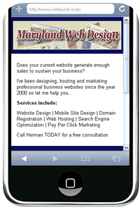
Recently I created a new mobile design for a Real Estate Company in Baltimore Maryland. I chose not to utilize responsive web design because the owner said many customers use mobile phones to contact his business therefore a dedicated mobile site would provide a fast, user friendly way for customers to contact him.

Mobile-friendly Design
I decided to build a one page (screen) mobile website that included a:

  • Header graphic: This includes a captivating image with a prominent logo so mobile users would know immediately what company they are contacting.
  • Title: This explains exactly what the business is about.
  • Introductory paragraph: This primarily outlines the benefits of doing business with this company.
  • Touch to call: This displays a small phone graphic with the business telephone number.

I also built an html version of the site for customers searching for his business using their computers.

My recommendation

Take a look at your website statistics. Are many customers accessing your website from mobile devices? If so, are they quickly and easily able to find the most relevant information with your current design?

If your mobile customers don’t need to view all the information available from a responsive designed site consider creating a dedicated mobile site that only contains the absolute information they need.

Get a Mobile Website For Your Business
Contact Maryland Web Design to discuss your company’s goals, objectives and the specific needs of your target audience.

Related Articles

Top 7 Reasons to Create a Mobile-Friendly Website
Mobile Website Design – Before and After Case Study
Create Your Own Mobile Website In Minutes With a Free Online Builder
7 Ways To Create A Mobile Version Of Your Website

5 Experts Review iSiteBuild.com and My 6 Big Takeaways

Recently took the leap to get my main website, iSiteBuild.com reviewed by a team of copyright and SEO experts. It was a humbling experience as I frequently review client’s websites. This often results in hiring me to redesign their site. Even though I thought I had done a good job redesigning iSiteBuild.com I realized getting objective reviews from others unearthed mistakes I never would have noticed myself no matter how long I analyzed my web pages.

The site is still in transition of being completed since being converted from a static site to a content management site using WordPress. You’ll notice some links and pages still need to be converted to the new platform.

Here are 7 of the biggest takeaways I got from the reviews:

1. Specify benefits/objectives of copy, images and video on the home page

Even though my target market are small business owners the words used in my content were too broad and not specific enough to differentiate my business from thousands of other web design companies. It was unclear if I was just serving local clients in Maryland or beyond. It was also unclear if I was a consulting firm or actually did design and SEO work.

The header image could be replaced with a video to give visitors a better idea what the site is about and how to serve them.

The video needs to be redone because it doesn’t reinforce my “unique competitive advantage” and I need to edit out the mistakes (ie jerky head).

2. Expand navigation links

The top navigation was missing links to the internal pages of my site and especially to my blog which contains a wealth of articles on Web Design and Marketing Tips. Links to internal pages need to be included.

3. Integrate blog with main website

Even though I tried to implement the same design as for my blog to make a seamless transition for visitors it was pointed out the blog should not be a separate site. Instead it should be a natural part of the main site.

4. Improve client testimonials

The testimonials say much the same as most other web design companies. It was suggested to add photos to improve conversions and include case studies to show how business improved after the website was designed.

5. Don’t rely on SEO to get new clients

“Do not rely on SEO for your visitors as Web design / SEO / Hosting is way too saturated of a market to get your visitors that way.”

I totally agree on this point because after the Google Penguin and Panda updates the top rankings I held for over a decade, tanked resulting in a dramatic decline of new clients.

6. Create a lead magnet opt-in

Getting visitors to fill in an opt-in form by offering a free report or e-course helps build a stream of contacts. You can then build a build a relationship with them and recommend my services.

***************

Read the 5 Expert Reviews below of the website: iSiteBuild.com

It takes some guts to submit your website for public critique, so I always extend my sincere thanks to those who offer up their work for my group of pros to pick apart in the name of improvement. We all recognize how hard it is to design & optimize a site that works well and also that everyone has their own opinions.

With that said, each of us took a look at the home page not following any particular criteria. We’ve given our honest feedback on how we believe the site can be improved.

The professionals commenting on this site have not seen what the others have written. Pay close attention to suggestions that are repeated across multiple reviews – that usually indicates a big stumbling block.

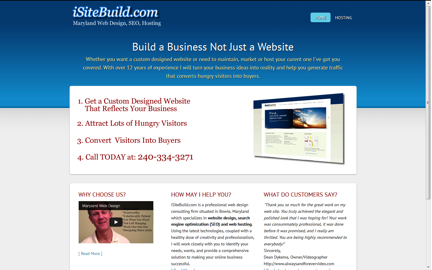
In this web page review, we’re looking at a web design, SEO and hosting company from Maryland (USA) called iSiteBuild.com. Owner Herman Drost operates this one-man show that promises to deliver a turnkey solution for organizations in need of a web presence.

isitebuild screen shot

Comments/Suggestions from Jill Whalen:
Confusing to have no top navigation. I felt like it was just a one page site which makes me leery. I did see more navigation at the bottom, but some may miss it.

While I think I understand that you’re just trying to convert people, I’ve always found that the more information you can provide people before trying to convert them, the better it will be for everyone. You’ll have less to do on your sales calls because they’ll be more familiar with what you offer, and they’ll have a better sense of who you are.

You should especially feature a link to the blog much more prominently. That’s where all the information that provides you with credibility is, and right now, most won’t even see it. (Wait, I just noticed that the blog takes one to another site DrostDesigns. What’s up with that? I’d highly recommend making it part of your main site and 301 redirecting that other one over to the main one.)

Do not rely on SEO for your visitors as Web design / SEO / Hosting is way too saturated of a market to get your visitors that way. Be sure that you’re doing lots of other forms of marketing, particularly local stuff.

Jill Whalen is an SEO Consultant who’s been helping companies with their website marketing since 1995. Be sure to sign up for Jill’s High Rankings Advisor Newsletter for free and informative SEO advice that’s easy to understand and fun to read!

Comments/Suggestions from Brian Massey, The Conversion Scientist

brian critique

Brian Massey is the author of the book for website managers called Your Customer Creation Equation: Unexpected Website Formulas of The Conversion Scientist. Get a free chapter and more at http://CustomerCreationEquation.com.

Comments/Suggestions from Justin Deville:

The page design is clear and simple. There’s an obvious structure. And the main sales message fits neatly ‘above the fold’. i.e., I don’t need to scroll down the page to see the key sales points.

The four numbered bullet points give me a clear sense of the service that’s on offer.

That said, there are a number of areas that I reckon could easily be improved.

There are lots of companies offering web hosting and design. So, I’d want this page to answer: what’s the main benefit of using the service? For example, the strap line could do more to explain the benefits of the service.

justin critique

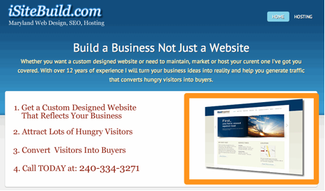
On the home page design, the image that’s used on the right-hand side of the page is illegible. It does nothing to sell the service. I might test a video in that position, showing off examples of websites that iSiteBuild has built. Or, another possibility would be to use a slider to show screenshots.

justin critique 2

I’m also unclear what the main objective of the page is. I’d guess that the site owner wants me to call: 240-334-3271. In which case, I’d make that call to action clearer. And I might offer an alternative means of contact for outside office hours. There’s no harm in repeating that number elsewhere on the page.

The site contains testimonials from existing clients, which is great to see. I might also add photos of the customers, as these can improve conversion.

Given that the site offers a web design service, I would expect to see best practice demonstrated. Yet, it fails in some obvious ways. I would usually expect to see the site navigation at the top of the page. Yet, the navigation only appears at the bottom of the page and is inconsistent across the site. There is no clear, standard navigation. Almost every page has a different navigation. As result, it’s difficult to find my way around. Here are three examples of navigation, though there are probably more:

nav 2

In other words, the site fails a basic usability test which doesn’t inspire me to make a purchase.

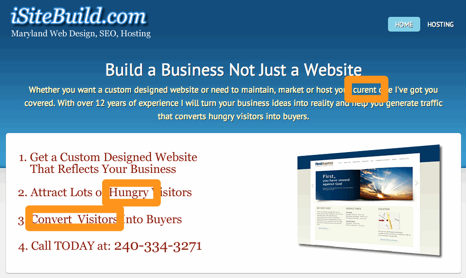
The home page shows a lack of attention to detail. There’s a spelling mistake and an unwanted double space. I’d also question whether ‘hungry’ is the best way of describing site visitors. Unless, of course, your site promotes a restaurant!

justin critique 3

Justin Deaville is Head of Search at internet marketing consultancy Receptional.com and was previously chief executive officer (CEO) at Wordtracker.com.

Comments/Suggestions from Kurt Scholle, Web Asylum

I like that the header is thin, allowing for more content to show above the fold.

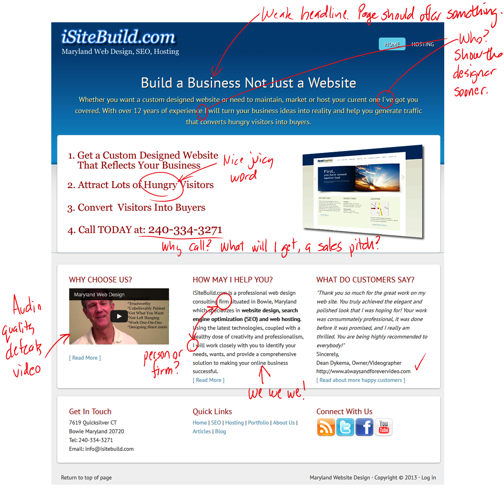
The headline, “Build a Business, Not Just a Website” is OK, but I think it needs to pop more. The verbiage below it is too much to read. I might suggest presenting a tight sub-headline rather than a paragraph.

Bullet points 1-3 make sense. The CTA should not be part of the benefits bullets. Is “Call Today…” the best CTA? Can I email you if its 10pm Sunday? Maybe there should be a lead magnet opt-in, such as an autoresponder sequence or eBook? The email is listed below left on the page, but it’s not clickable.

The graphic is difficult to see or sell why it supports the benefits of the offer.

I’d like to see an animation or video showing off sites that are clickable to case studies supporting the sites shown.

Overall, the design is nothing special.

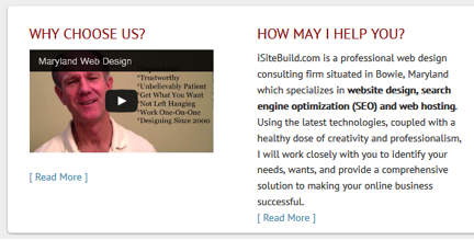
“How May I Help You” path headline isn’t as strong as something more suggestive, like “Who Wants to Double Their Business?”
Oh, the firm is “situated in Bowie, Maryland?” I live in Chicago, this must not be for me. Maybe that whole paragraph should define the process (bullets?). Scannable content is better here, I think.

Back to the paragraph under the headline; don’t begin with the word “Whether.”

“I’ve got you covered?” Weak. Using “We” instead of I projects that this is a team, not a one-man shop.

“With over 12 years of experience..” is also weak and supports the idea that this firm has limited capabilities.

I might put the social media icons above the fold. It will get you more conversations.

Kurt Scholle is Principal of Web Asylum, a Chicago web design firm.

Comments/Suggestions from me (Karon Thackston from Marketing Words)!

I am actually getting ready to redesign one of my websites. While I already have a web designer, I decided to approach iSiteBuild.com as if I were in search of design services.

The copy and headline in the opening paragraph left me with a couple of thoughts.

karon critique 1

I already have a business. I’m looking for a redesign, not a first-time design, so right off the bat I felt like this wasn’t for me. There are a lot of “I’s” in the copy: “I’ve” got you covered… “I” will turn your business ideas… (And “curent” is misspelled.) It seems to be more about you than about me, the customer.

The copy is very broad and general. Nothing specific is promised. I don’t see that you have a unique competitive advantage (UCA) that clearly lets me know why I should use you instead of others.

Nothing in the four bullet points is different than thousands of other web design companies will also tell me. You keep mentioning “hungry visitors” (twice within a 16-word span).

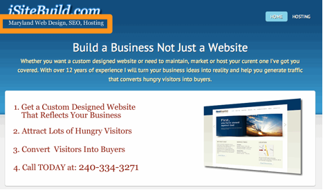
“Maryland Website Design, SEO and Hosting” (top, left corner) makes me think you only work with clients in Maryland. I clicked to the About page and found it was actually your portfolio. I decided to have a look while I was on this page. When I scrolled to the bottom, I found a few bullet points that gave a tiny bit of information about you/the company.

Because everybody is pretty much saying the same things, I need proof of performance. Testimonials from clients, case studies with before-and-after info and/or quantifiable data that shows without question that something improved due to your work. (I see you do have a testimonials page, but most of them are just saying how you completed the work on time, were nice to work with, etc. Every designer has these types of testimonials.)

karon critique 2

You have a video, which is good, but the editing is a little strange. It looks like your head keeps jerking to the left every time you start a new sentence. The edits are very obvious. The video isn’t reinforcing your UCA.

The “How May I Help You?” section is confusing. You ask how you may help then proceed to tell me all about you You refer to your business as a consulting firm. That makes me think you consult and that you do not actually do design/SEO work. You need to be clear about what you’re offering.

When I click the link for more information, I am taken to a page about submitting your site to the engines and keyword density. You really need to update the old information on your site as it makes you look like you’re using outdated techniques.

The site navigation seems to change location on various pages and also the links that are included, which makes it hard for me to find my way around. Many times there is no “Home” link.

They keywords you’ve selected for the Home page are very broad (unless you’re strictly going local which I wasn’t able to determine). The copy isn’t really optimized for these terms, they are just scattered around a bit.

Looking for conversion, copywriting or SEO help for your site? Contact Karon at Marketing Words today.

If you have other ideas for improving iSiteBuild.com please enter them in the comment box below.

How To Password Protect A File Or Folder And Stop Snoopers

Question


We need to password protect a file on our website that only allows access to Members.

How do we achieve this?

Answer

The easiest way to do this through cpanel (web hosting control panel).

Here are the steps:

1. Create a folder on the server containing the file that needs to be protected. For example the folder name is “Members” and the file name is “index.html”

2. Login to cpanel

3. Click on “password protected directories”

4. Under ‘security settings” check the box “Password protect this directory.”

5. Under “Name the protected directory” give a name to your directory. This name will pop-up when users login in.

6. Click “save” to save your settings.

7. Under “Create User” specify a username and password

8. Click “add/modify authorized user.”

9. Test the protected directory by entering the URL in your browser

10. A box will appear asking for a username and password. You’ll gain access to the protected file after logging in.

Note: You can place any type of sensitive files in the directory so it can be protected from snoopers.

Manual Method

1. Create a file named .htpasswd and place it in folder which contains the file to be protected.

2. Put the username and encrypted password inside the .htpasswd file as

john:n5MfEoHOIQkKg

3. Place the following code in your .htaccess file, in the same folder where you want to protect the file.

=================

<FilesMatch "file.html">
AuthName "Member Only"
AuthType Basic
AuthUserFile /home/cpanelusername/.htpasswd
require valid-user
</FilesMatch>

==================

4. Test access to your file by entering the URL to your file in your browser address bar.

5. Enter your login info in the box that appears

6. You should now be able to view your protected file

7. Only give your login info to the members who can gain access.

Read my follow-up article on
How to Prevent Your Forms From Being Stolen

Blue Snowball Microphone Review: Top 7 Benefits

  • Do you currently use a cheap microphone to create your podcasts or video slideshows?
  • Are you fed up with with the low quality sound it generates?
  • Do you want to dramatically improve your audio with a professional microphone?

For many years I’ve been using an inexpensive Logitech USB Desktop Microphone from Office Depot to record my voice when creating slideshows or doing voiceovers for my clients. The biggest problem was that they didn’t sound professional and often had to pay someone to create them. After extensive research I finally decided to purchase the Blue Snowball Microphone.

Top 7 Benefits and Features of the Blue Snowball Microphone
[Read more…]

Hire A Web Designer To Build Your Site: Top 7 Benefits

maryland web designer

Even though it may be tempting build your own website, in many cases hiring a professional web designer to do it for you makes more sense. Rather than wasting your time creating a mediocre site, spend a little bit of money upfront and get a high quality, custom website that accurately represents your business.

Here are the top 7 benefits of hiring a professional web designer:

[Read more…]